15 Matplotlib: Object-Oriented Approach to Plotting
15.0.1Lesson goals
Use the explicit
Figure- andAxes-based command structure to create highly customized plots.Import data and plot using NumPy and Matplotlib.
Add error bars to plots to show measurement uncertainty.
15.1Overview
The last lesson used the function-based, “implicit” command style to quickly make plots in
Matplotlib. It is called the implicit command style since it is implied that we want to work only on figure at a time,
and is facilitated by using the pyplot.plot() function.
In this command style, the Python interpreter implicitly controls objects associated with Matplotlib’s Figure and
Axes classes (we will talk about these classes very soon) when making figures. The benefit here is
we gain simplicity in plotting by giving up customization and complete plotting control.
The explicit command style focuses on explicitly creating these objects for each figure. This has a few benefits over
the implicit style. For one, we can backtrack, modify, and update figures quickly. This style also allows for more
flexibility in figure creation. The explicit command style is also the native figure implementation route in
Matplotlib. The implicit command style actually uses the explicit style but in an “implicit” way to obfuscate the
Figure and Axes classes. This helps onboard MATLAB users to Matplotlib quickly.
15.1.1Plotting using the explicit command style
Let’s replot a few figures from the previous lesson but now with the explicit command style. Before going any further we need to first load NumPy and Matplotlib into the shell:
import numpy as np
from matplotlib import pyplot as pltMatplotlib handles most simple plotting through the use of two built-in data classes: Figure and Axes. The
Figure class represents
the entire figure. You can think of it like the “canvas” that all features that will be shown on (e.g., axis,
borders, data points, labels). The
Axes class represents the
content of a figure panel.
This may seem confusing at first for a single panel figure, but Axes objects are very useful when creating multiple
panel figures (i.e., multiple subpanel figures on a canvas). Let’s create a simple figure that has one panel using
the explicit command style:
fig = plt.figure()                               # Creates Figure object
ax = fig.add_subplot(1, 1, 1)                    # Creates Axes object

plt.show()                                       # Shows plot
Notice the similarities and differences with this command style to what was shown with the
implicit style in the last lesson. The plt.plot() command from before is now replaced with
plt.figure(). This command creates a
Figure class object (here we assign it to a variable called fig). Again, you can think of this object as the white
background “canvas” of the figure.
The second command is the Figure-based method
.add_subplot(),
which initializes an Axes object (in this case we assign it to a variable called ax). The Axes object acts as the
stand-in for the actual figure (here just the x and y axes). Three input arguments are passed into .add_subplot().
The first two arguments represent the number of rows and columns of subpanel figures to be organized in fig
(arguments are called nrows and ncols, respectively). The third argument is the positioning index number
(called index) that ax will represent in the figure. For our current needs, we just need one Axes object
(i.e., one panel), so the (1, 1, 1) input argument suffices. While this command can seem somewhat confusing right
now, it will make more sense for multi-paneled plots. For now you can think of .add_subplot() as the OOP version of
plt.subplot() that was introduced in the
last lesson. The final command is
plt.show(), which tells the shell to display
the figure. This was introduced in the previous lesson as well.
Let’s again plot the cosine function from the last lesson but now using the explicit command style:
# Create the function
x1 = np.arange(1, 11, 0.05)
y1 = 10 * np.cos(2*x1)

# Figure creation
fig = plt.figure()
ax = fig.add_subplot(1, 1, 1)

ax.plot(x1, y1)                  # Plots data to Axes

plt.show()
Notice how we now issue
.plot() as a
method to the Axes object ax. We now explicitly call the Figure and Axes objects to make the figure. This example highlights the difference in syntax between the implicit and
explicit command styles. The implicit command style has commands passed directly to plt.plot(). Changes to Axes and
Figure objects are implied and handled through the plt.plot() function. The explicit command style instead passes
these commands directly to the Axes and Figure objects of the figure.
15.1.2Prettying things up (again)
Let’s make the figure look pretty like in the last lesson. Below is a code block that adds a title, axis labels, and tick marks:
# Figure creation
fig = plt.figure()
ax = fig.add_subplot(1, 1, 1)

# Plot the data
ax.plot(x1, y1)

# Making things pretty!
ax.set_title("Single plot of y1 vs. x1")  # Sets Axes title
ax.set_xlabel("x1")                       # Sets x-axis label
ax.set_ylabel("y1")                       # Sets y-axis label
ax.tick_params(axis="both",               # Adjust both x- & y-axis ticks
               direction="in",            # Tick mark direction set to inside
               top="on",                  # Show tick marks for top axis/spine
               right="on")                # Show tick marks for right axis/spine

# Show plot to shell
plt.show()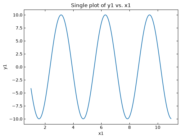
This again is similar to what was shown in the last lesson, but now we are using an OOP approach in figure creation.
Here, we use methods associated with the Axes object ax to change aspects of the figure. We use the
.set_title() method to set the
figure’s title, the
.set_xlabel() method to set the
x-axis label, the
.set_ylabel() method to set the
y-axis label, and the
.tick_params() method to adjust
the tick marks on each axis / spine.
The .set_xlim() and
.set_ylim() methods allow even more
flexibility in adjusting the x-axis and y-axis range than the
plt.axis() function from the implicit
command style. Let’s adjust the x-axis range from 0 → 12 and the y-axis range from -12 → 12:
# Figure creation
fig = plt.figure()
ax = fig.add_subplot(1, 1, 1)

# Plot the data
ax.plot(x1, y1)

# Making things pretty!
ax.set_title("Single plot of y1 vs. x1")
ax.set_xlabel("x1")
ax.set_ylabel("y1")
ax.tick_params(axis="both",
               direction="in",
               top="on",
               right="on")
ax.set_xlim(left=0, right=12)              # Set x-axis range
ax.set_ylim(bottom=-12, top=12)            # Set y-axis range

# Show plot to shell
plt.show()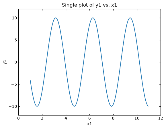
Changing the data point style (line, markers, colors) is done the same way as the
implicit command style but we now pass the arguments through the .plot()
method:
# Figure creation
fig = plt.figure()
ax = fig.add_subplot(1, 1, 1)

# Plot the data
ax.plot(x1, y1,
        linestyle="none",       # No connecting line
        marker="o",             # Circle marker points
        fillstyle="none",       # Markers are not filled
        markersize=12,          # Marker size of 12
        color="blue")           # Marker color is blue

# Making things pretty!
ax.set_title("Single plot of y1 vs. x1")
ax.set_xlabel("x1")
ax.set_ylabel("y1")
ax.tick_params(axis="both",
               direction="in",
               top="on",
               right="on")
ax.set_xlim(left=0, right=12)              # Set x-axis range
ax.set_ylim(bottom=-12, top=12)            # Set y-axis range

# Show plot to shell
plt.show()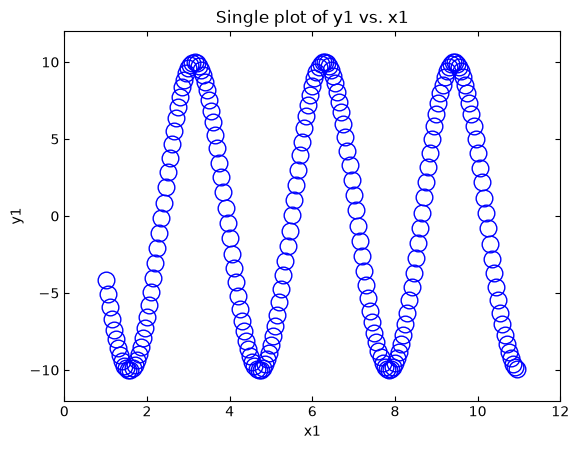
The arguments presented above in .plot() are the same from the
previous lesson in case you need a refresher on the details. Overall, the
command structure is very similar to the implicit command style except now we deal with the Figure and Axes objects
directly.
15.1.3Importing data into a plot
Importing data is the same as the implicit command style. The only difference is we send the data through the .plot()
method. Let’s replot the
blue foil UV-Vis transmission spectrum
from the last lesson. Recall that the data is stored in a two column file that contains the following:
First column: Light wavelength (unit: nm).
Second column: Transmission intensity (unit: counts).
Data points separated (i.e., delimited) with a “tab” character (
\t).First row contains header information.
The code block below uses numpy.loadtxt() to load the data into our Python shell:
# Load data
spectrum_data = np.loadtxt("./static/example-data/blue_foil_transmission_spectrum.txt",
                           delimiter="\t",
                           skiprows=1)

# x and y variables
wavelength = spectrum_data[:, 0]
intensity = spectrum_data[:, 1]

# Create figure
fig = plt.figure()
ax = fig.add_subplot(1, 1, 1)

# Plot data
ax.plot(wavelength, intensity,
        linestyle="solid",
        color="blue")

# Formatting figure
ax.set_title("Transmission Spectrum Blue Foil")
ax.set_xlabel("wavelength [nm]")
ax.set_ylabel("intensity [counts]")
ax.tick_params(axis="both",
               direction="in",
               top="on",
               right="on")
ax.set_xlim(left=200, right=1150)
ax.set_ylim(bottom=0)

# Display figure to shell
plt.show()
This example also demonstrates that we don’t need to provide every argument to each method (e.g., .set_ylim()). Here
we can allow the Python interpreter to autoscale the y-axis value. This flexibility is much easier to implement in
the explicit command style than using plt.axis() via the implicit command style.
15.1.4Plotting multiple datasets in single figure
Functionally similar to the implicit command style in which use the plt.plot() command multiple times over. In this
case, we use the .plot() method associated with each Axes object. Below demonstrates this using the three
functions from the last lesson:
# Datasets
x = np.arange(1, 11, 0.05)

y1 = 10 * np.cos(2*x)
y2 = 0.001 *np.exp(x) - 2.1
y3 = 2 * np.power(x,2) - (10 * x) - 3

# Create figure
fig_multidata = plt.figure()
ax_multidata = fig_multidata.add_subplot(1, 1, 1)

# y1 -> solid blue line
ax_multidata.plot(x, y1,
                  label="cosine",
                  linestyle="solid",
                  color="blue")

# y2 -> open red circles
ax_multidata.plot(x, y2,
                  label="exponent",
                  marker="o",
                  linestyle="none",
                  color="red")

# y3 -> forest green open stars with dashed connecting line
ax_multidata.plot(x, y3,
                  label="power",
                  marker="*",
                  fillstyle="none",
                  markersize=12,
                  linestyle="dashed",
                  color="forestgreen")

# Formatting figure
ax_multidata.set_title("Multiple dataset plot")
ax_multidata.set_xlabel("x")
ax_multidata.set_ylabel("y")
ax_multidata.tick_params(axis="both",
                         direction="in",
                         top="on",
                         right="on")
ax_multidata.set_xlim(left=0, right=12)
ax_multidata.set_ylim(bottom=-20, top=20)
ax_multidata.legend(frameon=False)

# Display figure to shell
plt.show()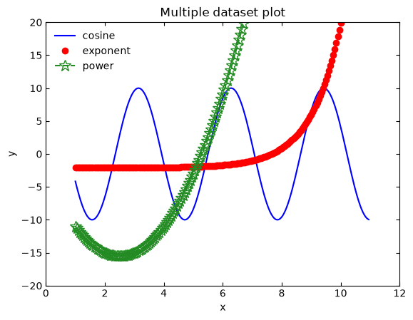
Notice the use of the
label
argument in each .plot() call and the .legend() method to display a proper legend. This again demonstrates that many of the commands from the implicit command
style are really based on methods associated with Figure and Axes objects.
15.1.4.1Example: Even more spectra
Replot the blue foil optical transmission spectrum from the previous example but also include the transmission spectrum for a green foil in the figure. Rename the figure title to be “Transmission Spectra of Colored Foils” and add a legend. Color code the data sets so that the blue foil data is blue and the green foil data is green.
Solution:
As the lesson above discusses, plotting multiple data sets in a common figure is straightforward with Matplotlib. We
just need to ensure that all data sets are plotted to the same Axes object (this also implies a common Figure
object). From here, we issue separate .plot() calls for each data set and then a .legend() command to display the
legend. The code below demonstrates this:
# Libraries
import numpy as np
from matplotlib import pyplot as plt

# Load blue foil
blue_foil = np.loadtxt("./static/example-data/blue_foil_transmission_spectrum.txt",
                       delimiter="\t",
                       skiprows=1)

blue_wavelength = blue_foil[:, 0]
blue_intensity = blue_foil[:, 1]

# Load green foil
green_foil = np.loadtxt("./static/example-data/green_foil_transmission_spectrum.txt",
                        delimiter="\t",
                        skiprows=1)

green_wavelength = green_foil[:, 0]
green_intensity = green_foil[:, 1]

# Create Figure
fig = plt.figure()
ax = fig.add_subplot(1, 1, 1)

# Plot the blue foil
ax.plot(blue_wavelength, blue_intensity,
        linestyle="solid",
        color="blue",
        label="blue foil")

# Plot the green foil
ax.plot(green_wavelength, green_intensity,
        linestyle="solid",
        color="green",
        label="green foil")

# Format the figure
ax.set_title("Transmission Spectra of Colored Foils")
ax.set_xlabel("wavelength [nm]")
ax.set_ylabel("intensity [counts]")
ax.tick_params(axis="both",
               direction="in",
               top="on",
               right="on")
ax.set_xlim(left=200, right=1150)
ax.set_ylim(bottom=0, top=10000)
ax.legend(frameon=False)

# Display figure to shell
plt.show()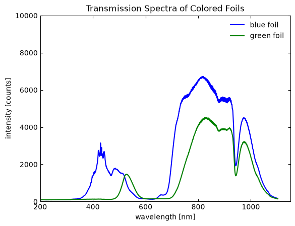
15.1.5Multiple panel plotting
Multiple panel (i.e., subpanel) plots are done in similar way to the implicit command style but we now
issue the “subplot” command through the
.add_subplot() method
associated with the Figure class. This is demonstrated in the code block below using our three functions from earlier:
# 2 x 2 grid of sub-panels. Label numbers:
# |-----|-----|
# |  1  |  2  |
# |-----|-----|
# |  3  |  4  |
# |-----|-----|

# Make the Figure object
fig = plt.figure(figsize=[12, 9])
fig.suptitle("Main figure title")

# Subpanel a -> top left
axA = fig.add_subplot(2, 2, 1)
axA.plot(x, y1, label="cosine", color="blue")
axA.set_title("Cosine plot")
axA.set_xlabel("x")
axA.set_ylabel("y1")

# Subpanel b -> top right
axB = fig.add_subplot(2, 2, 2)
axB.plot(x, y2, label="exponent", linestyle="none", marker="o", color="red")
axB.set_title("Exponential plot")
axB.set_xlabel("x")
axB.set_ylabel("y2")

# Subpanel c -> bottom left
axC = fig.add_subplot(2, 2, 3)
axC.plot(x, y3, label="power", linestyle="dashed", color="forestgreen")
axC.set_title("Power law plot")
axC.set_xlabel("x")
axC.set_ylabel("y3")

# Display figure to shell
plt.show()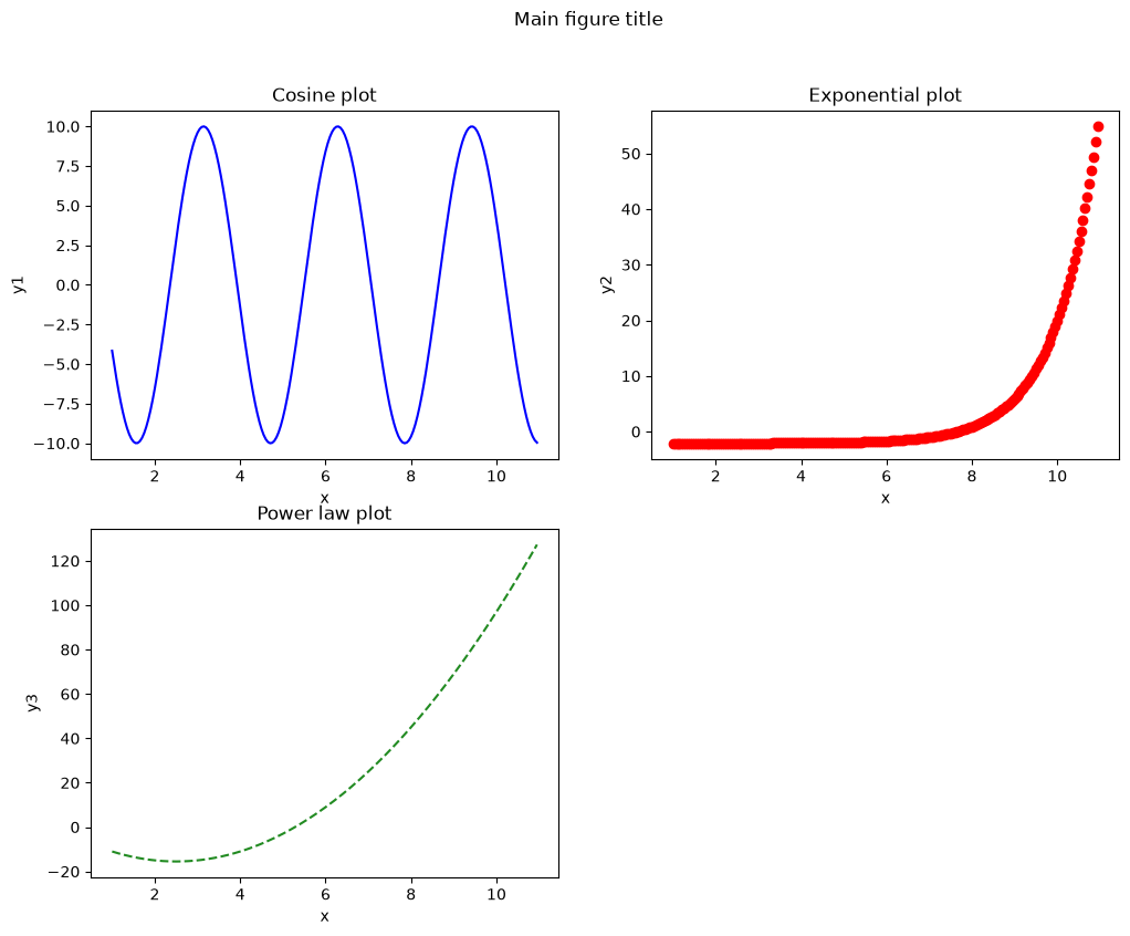
We added a few options to this figure to make it more presentable. We again use the figsize argument to change the
Figure object’s size to get everything to display properly (similar to the implicit command style version). The
.suptitle() method associated
with the Figure class allows us to create a “super” title for the entire figure. Furthermore, we also use
.set_title() method associated with
the Axes class to set a title for each subpanel. This also works for a single figure as well.
15.1.6Plotting with error bars
Adding error bars to plots in Matplotlib is done by replacing the .plot() method with the
.errorbar()
method. All we need to do is provide arguments on the sizes for the - and -error bars. Let’s plot the following
function,
and set the error bar size for as and size of the error bars for as :
# Libraries
import numpy as np
from matplotlib import pyplot as plt

# Create the dataset and error bar values
x4 = np.arange(0.1, 20, 0.4)
x4_error = abs(0.05 * x4)
y4 = (10 * np.cos(2 * x4)) / (x4)
y4_error = abs(0.50 * y4)

# Create the Figure and Axes
fig4 = plt.figure()
ax4 = fig4.add_subplot(1, 1, 1)

# Plot the data using .errorbar()
ax4.errorbar(x4, y4,                 # Plot with error bars
             xerr=x4_error,          # x-axis error bars
             yerr=y4_error,          # y-axis error bars
             marker="p",
             markersize=8,
             linestyle="none",
             color="chocolate",
             capsize=5)              # error bar cap size

# Formatting the figure
ax4.set_title("Plot with Error Bars")
ax4.set_xlabel("x4")
ax4.set_ylabel("y4")
ax4.tick_params(axis="both", direction="in")
ax4.tick_params(top="on")
ax4.tick_params(right="on")
ax4.set_xlim(left=0, right=20)
ax4.set_ylim(bottom=-12, top=12)

# Display figure to shell
plt.show()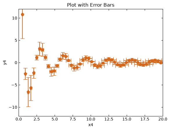
This can also be done with the implicit command style using
plt.errorbar(). You can choose the route
you want to go!
15.1.7Final thoughts
So which command style is better? The implicit command style is useful for making plots quickly as you do not need to
explicitly create Figure and Axes objects. However, you need to be mindful on the order of your commands when you
want to make multiple plots simultaneously. The explicit command style is the actual implementation of Matplotlib.
This command style does require a few more commands, but can offer more ways to create, adjust, and update figures.
Coding in Python is about freedom and choice, it is up to you on how you want to code. You will see both commands styles when reading code, so it is important to be knowledge in both.
Happy plotting!