16 Matplotlib: More Plotting Tips
16.1Lesson goals
Learn to export figures for later use.
Create OriginLab’s "Origin-like” figures.
Explore more plotting options in the Matplotlib library.
Learn how to plot bar graphs and histograms.
Learn how to change default settings in Matplotlib.
16.2Overview
With the previous two Matplotlib lessons under our belt (i.e., the implicit and explicit command lessons), let’s explore some more topics about plotting. This lesson will go over how to export figures, how to further enhance the overall aesthetics of figures, how to make bar graphs and histogram plots, and how to temporarily change default figure settings during runtime.
16.3Exporting figures
Matplotlib provides a Figure-based method called
.savefig()
to quickly save your figures. To demonstrate this, let’s recreate our optical spectra data from the
last lesson:
# Libraries
import numpy as np
from matplotlib import pyplot as plt

# Load blue foil
blue_foil = np.loadtxt("./static/example-data/blue_foil_transmission_spectrum.txt",
                       delimiter="\t",
                       skiprows=1)

blue_wavelength = blue_foil[:, 0]
blue_intensity = blue_foil[:, 1]

# Load green foil
green_foil = np.loadtxt("./static/example-data/green_foil_transmission_spectrum.txt",
                        delimiter="\t",
                        skiprows=1)

green_wavelength = green_foil[:, 0]
green_intensity = green_foil[:, 1]

# Create Figure
fig = plt.figure()
ax = fig.add_subplot(1, 1, 1)

# Plot the blue foil
ax.plot(blue_wavelength, blue_intensity,
        linestyle="solid",
        color="blue",
        label="blue foil")

# Plot the green foil
ax.plot(green_wavelength, green_intensity,
        linestyle="solid",
        color="green",
        label="green foil")

# Format the figure
ax.set_title("Transmission Spectra of Colored Foils")
ax.set_xlabel("wavelength [nm]")
ax.set_ylabel("intensity [counts]")
ax.tick_params(axis="both",
               direction="in",
               top="on",
               right="on")
ax.set_xlim(left=200, right=1150)
ax.set_ylim(bottom=0, top=10000)
ax.legend(frameon=False)

# Display figure to shell
plt.show()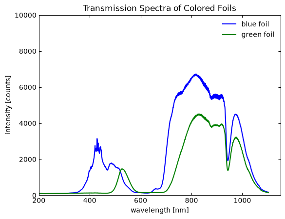
We can issue the following command to save an image of the figure in the current working folder:
fig.savefig("spectra.png")It is important to add the desired extension in the filename. There are many optional arguments for .savefig() that
will adjust export settings. Overall, a quick and easy way to save the figure.
16.4Origin-like figures
OriginLab’s Origin plotting software is commonly used in scientific and engineering disciplines because it can create clean, impactful, and complex figures. Origin however is a close-sourced, commercial software that requires a license to use (i.e., costs money) and only runs in the Windows operating system. Thankfully, we can create “Origin-like” figures in Matplotlib using some simple commands. Origin-based figures typically have these common characteristics:
Arial font type.
Decreasing font sizes from title → axis label → axis numbers.
Simple colors for data sets.
Minor tick marks (1 minor tick mark for every major tick mark).
We can mimic many of these attributes with Python. The only one we cannot consistently do is using the Arial font as it is operating system dependent. If you use a Windows operating system you do have the ability to change Matplotlib’s font to Arial as well.
Let’s redo the previous figure using most of these features and also export it all in one code block:
# Libraries
import numpy as np
from matplotlib import pyplot as plt

# Need the ticker library for tick marks modification!
from matplotlib import ticker as tck

# Load blue foil
blue_foil = np.loadtxt("./static/example-data/blue_foil_transmission_spectrum.txt",
                       delimiter="\t",
                       skiprows=1)

blue_wavelength = blue_foil[:, 0]
blue_intensity = blue_foil[:, 1]

# Load green foil
green_foil = np.loadtxt("./static/example-data/green_foil_transmission_spectrum.txt",
                        delimiter="\t",
                        skiprows=1)

green_wavelength = green_foil[:, 0]
green_intensity = green_foil[:, 1]

# Create Figure
fig = plt.figure()
ax = fig.add_subplot(1, 1, 1)

# Plot the blue foil
ax.plot(blue_wavelength, blue_intensity,
        linestyle="solid",
        color="blue",
        label="blue foil")

# Plot the green foil
ax.plot(green_wavelength, green_intensity,
        linestyle="solid",
        color="green",
        label="green foil")

# Format the figure
ax.set_title("Transmission Spectra of Colored Foils",
             fontsize=16)                       # 16 pt title size
ax.set_xlabel("$\\lambda$ [nm]",
              fontsize=14)                      # 14 pt axis size
ax.set_ylabel("I [cts]",
              fontsize=14)                      # 14 pt axis size


# Set the major tick mark spacing on the y-axis
ax.yaxis.set_major_locator(tck.MultipleLocator(2000))

# Turn on minor tick marks -> 1 minor for every major
ax.xaxis.set_minor_locator(tck.AutoMinorLocator(2))
ax.yaxis.set_minor_locator(tck.AutoMinorLocator(2))

# Tick mark formatting
ax.tick_params(axis="both",
               which="both",                    # Both major and minor ticks
               direction="in",
               top="on",
               right="on")


ax.set_xlim(left=200, right=1150)
ax.set_ylim(bottom=0, top=10000)
ax.legend(frameon=False, fontsize=14)           # No border, 14 pt font

# Display figure to shell
plt.show()

# Save figure
fig.savefig("spectraOrigin.png")
This figure now looks even better! Many of the changes are based on what you have already seen but with minor
alternations to the arguments. However, we do need to use Matplotlib’s
ticker module to adjust the tick marks.
There are two locations where we use this module. The first location is when we issue the
.yaxis.set_major_locator() method. Here, the
MultipleLocator class is
used to put a major tick mark every 2000 cts. This module allows us to adjust the spacing of the major axis (i.e., the
numbered) tick marks. The second location is when we issue the .xaxis.set_minor_locator() and the
.yaxis.set_minor_locator() methods. The
AutoMinorLocator class is
used to put one minor tick mark between each major tick mark.
Overall, these minor changes to our plotting codebase makes our figures look even more professional and impactful.
16.5Side topic: Greek letters, mathematical expressions, non-standard characters in plots
As seen above, we can even add Greek symbols to figures. Matplotlib utilizes a mathematical-based text parser called Mathtext, which is associated with the TeX expression parser that is tied to LaTeX. IPython notebook files use a similar mathematical-based text parser called MathJax.
In the context of plotting with Matplotlib, they are essentially the same with some minor differences. We simply need to know that Mathtext is the Python-based implementation of the TeX expression parser used in Matplotlib and MathJax is the JavaScript-based implementation that is often used in web browsers and Markdown files. Their scripting language is nearly the same, so it is good to learn some basics if you want to make aesthetically pleasing figure labels.
16.5.1Basic use
Mathematical expressions are bounded between $ characters. This tells Mathtext or MathJax that the text between the
$ characters should be represented as mathematical-based characters. Single $ characters provide in-line expressions
and $$ provide new-line expressions. Examples for both are shown below:
In-line example:
Typed out version: “Newton’s second law is $F=ma$”.
Converted version: “Newton’s second law is ”.
New-line example
Typed out version: “Ohm’s law is,” $$V = IR$$
Converted version: “Ohm’s law is,”
16.5.2Greek letters
Greek letters are commonly used in science and engineering fields. We can create Greek letters by typing out the letter
name after the \ character. Capitalizing the the first letter often gives the capitalized version:
Typed out version: $\alpha$, $\Alpha$, $\theta$, $\Theta$, $\gamma$, $\Gamma$
Converted version: , , , , ,
16.5.3Mathematical constructions
We can even do various mathematical symbols, fractions, equations, and more!
Typed out version: $\cdot$, $\frac{a}{b}$, $e^{2x}$, $y = x_{1,2}$
Converted version: , , ,
16.5.4Use in Matplotlib
You can use the in-line expression notation in any title, axes, label, or text box associated with a Matplotlib figure.
The figure above, for example, adds the Greek letter lambda () to the x-axis label.
Depending on your version of Python and Matplotlib, you may need to add a double \\ before some terms (e.g.,
\\lambda) as Python treats \ in a string as an escape character. The \\ escapes out
of the escape character.
There are many online sources available to help you incorporate mathematical terms and symbols to your plots. We particularly like this online example guide.
16.6Bar graphs
Besides scatter plots, Matplotlib can make other styles of figures, including bar graphs. Bar graphs are created using
the .bar() method associated with the
Axes class. It is similar to .plot()
for Axes objects but with a few different arguments.
Let’s make a bar graph using
Rockwell hardness testing data from five samples. The code block below
demonstrates how to use the .bar() method:
# -----------------------------------------------------------------------------
# Load data file
# -----------------------------------------------------------------------------
data = np.loadtxt("./static/example-data/hardness-tests.txt",
                           delimiter=",",
                           skiprows=1)

sample = data[:, 0]
hardness = data[:, 1]

# -----------------------------------------------------------------------------
# Plot data
# -----------------------------------------------------------------------------
# Create Figure object
fig = plt.figure()

# Create Axes object
ax = fig.add_subplot(1, 1, 1)

# Plot bar graph
ax.bar(sample, hardness,
       color="pink",          # optional: color of bar
       edgecolor="black",     # optional: color of edge
       linewidth=1.5)         # optional: width of edge color

# -----------------------------------------------------------------------------
# Figure options
# -----------------------------------------------------------------------------
# Title
ax.set_title("Rockwell Hardness Test Results",
              fontsize=16)

# x-axis label
ax.set_xlabel("Sample",
               fontsize=14)

# y-axis label
ax.set_ylabel("Hardness (HRB)",
               fontsize=14)

# Set the major tick mark spacing on the y-axis
ax.yaxis.set_major_locator(tck.MultipleLocator(20))

# Turn on minor tick marks -> 1 minor for every major
ax.yaxis.set_minor_locator(tck.AutoMinorLocator(2))

# Tick marks
ax.tick_params(axis="both",
               which="both",
               direction="in",
               top="on",
               right="on",
               labelsize=12)

# Set y-axis limits
ax.set_ylim(bottom=0, top=80)

# -----------------------------------------------------------------------------
# Display plot
# -----------------------------------------------------------------------------
plt.show()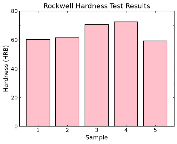
This figure looks decent but the axes /splines thickness are a bit too thin compared to the bar borders. We can make
them thicker using two new commands. The optional width argument in
.tick_params() will allow us to
adjust the tick mark width. We can use multiple methods from the
spines class to adjust the axes / spines
thickness. The code block below demonstrates how we can use these new features:
# Axes thicker version

# -----------------------------------------------------------------------------
# Plot data
# -----------------------------------------------------------------------------
# Create Figure object
fig = plt.figure()

# Create Axes object
ax = fig.add_subplot(1, 1, 1)

# Plot bar graph
ax.bar(sample, hardness,
       color="pink",        # optional: color of bar
       edgecolor="black",   # optional: color of edge
       linewidth=1.5)         # optional: width of edge color

# -----------------------------------------------------------------------------
# Figure options
# -----------------------------------------------------------------------------
# Title
ax.set_title("Rockwell Hardness Test Results",
              fontsize=16)           # Size 16 pt font

# x-axis label
ax.set_xlabel("Sample",
               fontsize=14)          # Size 14 pt font

# y-axis label
ax.set_ylabel("Hardness (HRB)",
               fontsize=14)          # Size 14 pt font

# Set the major tick mark spacing on the y-axis
ax.yaxis.set_major_locator(tck.MultipleLocator(20))

# Turn on minor tick marks -> 1 minor for every major
ax.yaxis.set_minor_locator(tck.AutoMinorLocator(2))

# Tick marks
ax.tick_params(axis="both",          # Adjust both x- & y-axis ticks
               which="both",         # Both major and minor
               direction="in",       # Tick mark direction set to inside
               top="on",             # Display tick marks for top axis / spine
               right="on",           # Display tick marks for right axis / spine
               labelsize=12,         # Size 12 pt font
               width=1.5)            # Slightly thicker ticks

# Spine widths
ax.spines.left.set_linewidth(1.5)
ax.spines.right.set_linewidth(1.5)
ax.spines.top.set_linewidth(1.5)
ax.spines.bottom.set_linewidth(1.5)

# Set y-axis limits
ax.set_ylim(bottom=0, top=80)

# -----------------------------------------------------------------------------
# Display plot
# -----------------------------------------------------------------------------
plt.show()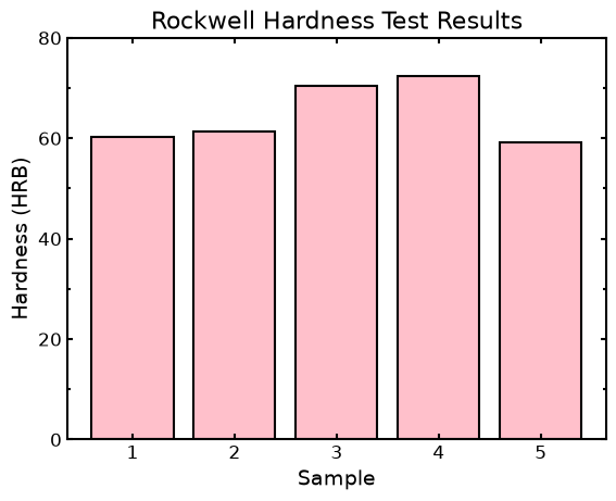
Overall, these simple changes quickly enhances the quality of the figure.
16.7Histograms
Making a histogram plot (i.e., number of occurrences vs. some feature) is very common. Histograms are often used in particle size analysis of optical microscopy or electron microscopy images. In this example, we will go over how to make a histogram using something simpler...one of author’s music album collection. Our goal here is to make a histogram that bins every year from the oldest album year to the newest album year. We also want to extract the following “useful” metrics:
Oldest year
Newest year
Range of years
Average album year
Median album year
Total number of albums
The first we should do is load the data into the Python shell. Let’s load the data as an NumPy array:
# -----------------------------------------------------------------------------
# Load data file
# -----------------------------------------------------------------------------
years = np.loadtxt("./static/example-data/album-collection.txt", skiprows=1, dtype=int)
Histograms are plotted using either the
pyplot.hist() function (implicit command
style) or the .hist() method for the
Axes class (explicit command style). We will use the explicit command style for this demonstration. Both commands
have many arguments that can be used, but we are going to focus on two arguments in particular. The first argument is
bins, which is the number of equally spaced bars between a lower and upper limit (i.e., in this case how many years
wide is each bar). The other argument is range, which sets the lower and upper limits to bin over (i.e., in this case
the oldest and newest years). This argument is entered as a tuple.
Let’s first start by extracting out the metrics we want, which can be done solely using NumPy commands:
# -----------------------------------------------------------------------------
# Finding first, last year, bin size
# -----------------------------------------------------------------------------

# Oldest and newest years
minyear = years.min()
maxyear = years.max()

# Number of years in range => # of bins
yearRange = int(maxyear - minyear)

# Average year
avgyear = np.mean(years)

# Median year
medianyear = np.median(years)

# Number of albums (extra!)
total = years.size

print("Oldest:", minyear)
print("Newest:", maxyear)
print("Range:", yearRange, "years")
print("Average year:", int(round(avgyear,0)))
print("Median year:", int(round(medianyear,0)))
print("Total number of albums:", total)
Oldest: 1967
Newest: 2025
Range: 58 years
Average year: 2003
Median year: 2003
Total number of albums: 457
Many of these metric-based functions were discussed in the NumPy lesson except for
numpy.median() which calculates the
median value of a set of numbers. The code block below creates the histogram
using .hist().
# -----------------------------------------------------------------------------
# Plot data
# -----------------------------------------------------------------------------
# Create Figure object
fig = plt.figure()

# Create Axes object
ax = fig.add_subplot(1, 1, 1)

# Plot measured data
ax.hist(years,
       range=(minyear, maxyear+1),        # +1 added to include newest year
       bins=yearRange+1,                  # similar issue
       color="lightgreen",
       edgecolor="black")

# -----------------------------------------------------------------------------
# Figure options
# -----------------------------------------------------------------------------

# Title
ax.set_title("Album collection",
              fontsize=16)

# x-axis label
ax.set_xlabel("Album year",
               fontsize=14)

# y-axis label
ax.set_ylabel("Counts",
               fontsize=14)

# Set major yaxis tick mark spacing (4 units)
ax.yaxis.set_major_locator(tck.MultipleLocator(4))

# Minor tick marks turn on
ax.xaxis.set_minor_locator(tck.AutoMinorLocator(2))
ax.yaxis.set_minor_locator(tck.AutoMinorLocator(2))

# Tick marks
ax.tick_params(axis="both",
               which="both",
               direction="in",
               top="on",
               right="on",
               labelsize=12,
               width=1.5)

# Spine widths
ax.spines.left.set_linewidth(1.5)
ax.spines.right.set_linewidth(1.5)
ax.spines.top.set_linewidth(1.5)
ax.spines.bottom.set_linewidth(1.5)

# Set axis ranges
ax.set_xlim(left=(minyear-10), right=(maxyear+10))
ax.set_ylim(bottom=0, top=24)

# -----------------------------------------------------------------------------
# Display plot
# -----------------------------------------------------------------------------
plt.show()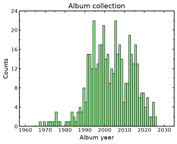
The code has a few tweaks to various ranges in order to make the figure look correct. For example, both the
range and bins arguments in .hist() have +1 added to them in order to get the most recent year to
display properly (see the bins argument explanation in the
official .hist() documentation for details).
We also set the plot’s -axis range is start 10 years before the first album year and end 10 years after the last
album year for readability purposes. It is important to remember the plot range is different than the range argument
in .hist() when making
histogram plots.
16.8Changing a project’s default plot settings
You may have noticed by now that many of our modifications to each figure have similar commands and adjustments.
Instead of constantly making these changes on the indidivudal figure level, Matplotlib has a few different ways for you
to make these changes to all plots at once. One semi-permanent way (i.e., works for all plots in a coding session) is to modify Matplotlib’s default
runtime configuration
parameter settings, also known as
rcParams.
Changes to rcParams are made through the dict-like object
matplotlib.rcParams and
there are
numerous settings
that can be changed. Below is an example of some of the parameters that can be changed.
Please note that the changes below are not in any way good default settings! They are chosen to show how rcParams can modify all plots at once.
# Change title size & color
plt.rcParams["axes.titlesize"] = 26
plt.rcParams["axes.titlecolor"] = "red"

# Change all axis label size
plt.rcParams["axes.labelsize"] = 20

# Change all x-axis values
plt.rcParams["xtick.labelsize"] = 14
plt.rcParams["xtick.major.size"] = 5
plt.rcParams["xtick.major.width"] = 3
plt.rcParams["xtick.minor.size"] = 5
plt.rcParams["xtick.minor.width"] = 3
plt.rcParams["xtick.color"] = "purple"
plt.rcParams["xtick.direction"] = "in"
plt.rcParams["xtick.top"] = True

# Change all y-axis values
plt.rcParams["ytick.labelsize"] = 5
plt.rcParams["ytick.major.size"] = 5
plt.rcParams["ytick.major.width"] = 3
plt.rcParams["ytick.minor.size"] = 1
plt.rcParams["ytick.minor.width"] = 1
plt.rcParams["ytick.color"] = "green"
plt.rcParams["ytick.direction"] = "in"
plt.rcParams["ytick.right"] = True

# Spines (the actual axis borders)
plt.rcParams['axes.linewidth'] = 5
plt.rcParams["axes.spines.bottom"] = True
plt.rcParams["axes.spines.top"] = True
plt.rcParams["axes.spines.left"] = True
plt.rcParams["axes.spines.right"] = True

# Legend settings
plt.rcParams["legend.frameon"] = False
plt.rcParams["legend.fontsize"] = 18
We can now shorten our code blocks focused on plotting they are easier to read. Below are the previous three plots but now with the global changes. Again, the parameter changes are chosen just to show that they can be done. These changes are not aesthetically pleasing in any manner!
# -----------------------------------------------------------------------------
# Album collection plot
# -----------------------------------------------------------------------------
figD = plt.figure()
axD = figD.add_subplot(1, 1, 1)

axD.hist(years,
       range=(minyear, maxyear+1),
       bins=yearRange+1,
       color="lightgreen",
       edgecolor="black")

axD.yaxis.set_major_locator(tck.MultipleLocator(4))
axD.xaxis.set_minor_locator(tck.AutoMinorLocator(2))
axD.yaxis.set_minor_locator(tck.AutoMinorLocator(2))

axD.set_title("Album collection")
axD.set_xlabel("Album year")
axD.set_ylabel("Counts")
axD.set_xlim(left=(minyear-10), right=(maxyear+10))
axD.set_ylim(bottom=0, top=24)

# -----------------------------------------------------------------------------
# Hardness plot
# -----------------------------------------------------------------------------

figC = plt.figure()
axC = figC.add_subplot(1, 1, 1)

# Plot bar graph
axC.bar(sample, hardness,
       color="pink",          # optional: color of bar
       edgecolor="black",     # optional: color of edge
       linewidth=1.5)         # optional: width of edge color

axC.yaxis.set_minor_locator(tck.AutoMinorLocator(2))

axC.set_title("Rockwell Hardness Test Results")
axC.set_xlabel("Sample")
axC.set_ylabel("Hardness (HRB)")


# -----------------------------------------------------------------------------
# Transmission plot
# -----------------------------------------------------------------------------

figB = plt.figure()
axB = figB.add_subplot(1, 1, 1)

axB.plot(blue_wavelength, blue_intensity,
        linestyle="solid",
        color="blue",
        label="blue foil")

axB.plot(green_wavelength, green_intensity,
        linestyle="solid",
        color="green",
        label="green foil")

axB.yaxis.set_major_locator(tck.MultipleLocator(2000))
axB.xaxis.set_minor_locator(tck.AutoMinorLocator(2))
axB.yaxis.set_minor_locator(tck.AutoMinorLocator(2))


axB.set_title("Transmission Spectra of Colored Foils")
axB.set_xlabel("$\\lambda$ [nm]")
axB.set_ylabel("I [counts]")
axB.set_xlim(left=180, right=1150)
axB.set_ylim(bottom=0, top=7000)
axB.legend()

# -----------------------------------------------------------------------------
# Display plot
# -----------------------------------------------------------------------------
plt.show()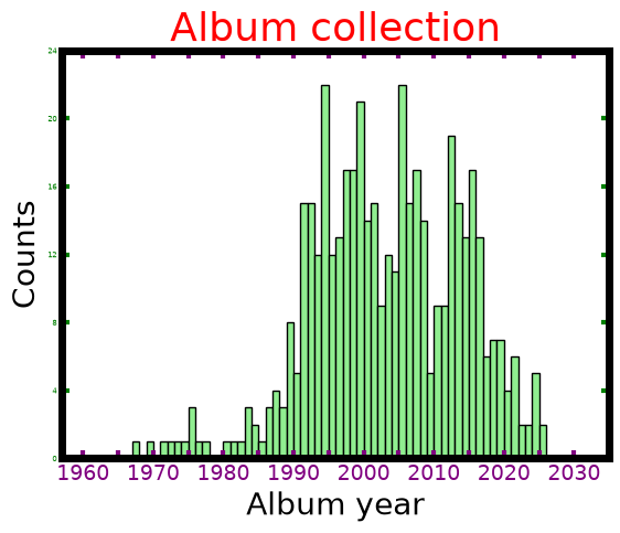
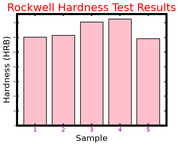
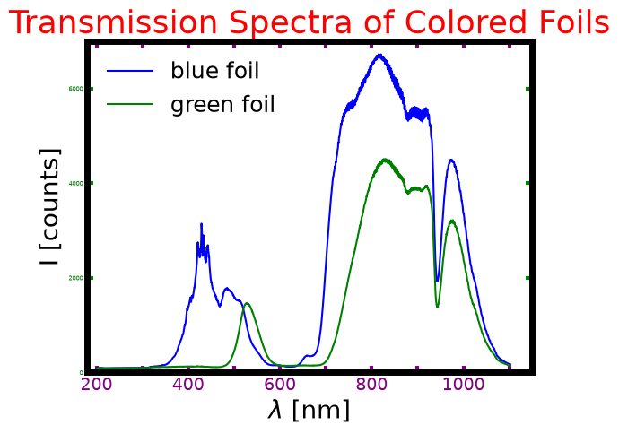
Even though these figures are now unsightly to look at, we see that adjusting rcParams affects all plots, which
helps cut down on the amount of repetivite commands. Remember that matplotlib.rcParams changes everything during a
runtime session. If you want to see the plots from earlier you need to restart your Python shell or you can run the
command matplotlib.rcdefaults():
plt.rcdefaults()Here are some better rcParams overrides:
# Title size & color
plt.rcParams["axes.titlesize"] = 16

# Axis label size
plt.rcParams["axes.labelsize"] = 14

# X-axis values
plt.rcParams["xtick.labelsize"] = 12
plt.rcParams["xtick.direction"] = "in"
plt.rcParams["xtick.top"] = True

# Y-axis values
plt.rcParams["ytick.labelsize"] = 12
plt.rcParams["ytick.direction"] = "in"
plt.rcParams["ytick.right"] = True

# Spines (the actual axis borders)
plt.rcParams["axes.spines.bottom"] = True
plt.rcParams["axes.spines.top"] = True
plt.rcParams["axes.spines.left"] = True
plt.rcParams["axes.spines.right"] = True

# Legend settings
plt.rcParams["legend.frameon"] = False
plt.rcParams["legend.fontsize"] = 14
Let’s replot the three figures now with these better default settings:
# -----------------------------------------------------------------------------
# Album collection plot
# -----------------------------------------------------------------------------
figD = plt.figure()
axD = figD.add_subplot(1, 1, 1)

axD.hist(years,
       range=(minyear, maxyear+1),
       bins=yearRange+1,
       color="lightgreen",
       edgecolor="black")

axD.yaxis.set_major_locator(tck.MultipleLocator(4))
axD.xaxis.set_minor_locator(tck.AutoMinorLocator(2))
axD.yaxis.set_minor_locator(tck.AutoMinorLocator(2))

axD.set_title("Album collection")
axD.set_xlabel("Album year")
axD.set_ylabel("Counts")
axD.set_xlim(left=(minyear-10), right=(maxyear+10))
axD.set_ylim(bottom=0, top=24)

# -----------------------------------------------------------------------------
# Hardness plot
# -----------------------------------------------------------------------------

figC = plt.figure()
axC = figC.add_subplot(1, 1, 1)

# Plot bar graph
axC.bar(sample, hardness,
       color="pink",          # optional: color of bar
       edgecolor="black",     # optional: color of edge
       linewidth=1.5)         # optional: width of edge color

axC.yaxis.set_minor_locator(tck.AutoMinorLocator(2))

axC.set_title("Rockwell Hardness Test Results")
axC.set_xlabel("Sample")
axC.set_ylabel("Hardness (HRB)")


# -----------------------------------------------------------------------------
# Transmission plot
# -----------------------------------------------------------------------------

figB = plt.figure()
axB = figB.add_subplot(1, 1, 1)

axB.plot(blue_wavelength, blue_intensity,
        linestyle="solid",
        color="blue",
        label="blue foil")

axB.plot(green_wavelength, green_intensity,
        linestyle="solid",
        color="green",
        label="green foil")

axB.yaxis.set_major_locator(tck.MultipleLocator(2000))
axB.xaxis.set_minor_locator(tck.AutoMinorLocator(2))
axB.yaxis.set_minor_locator(tck.AutoMinorLocator(2))


axB.set_title("Transmission Spectra of Colored Foils")
axB.set_xlabel("$\\lambda$ [nm]")
axB.set_ylabel("I [counts]")
axB.set_xlim(left=180, right=1150)
axB.set_ylim(bottom=0, top=7000)
axB.legend()

# -----------------------------------------------------------------------------
# Display plot
# -----------------------------------------------------------------------------
plt.show()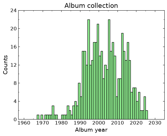
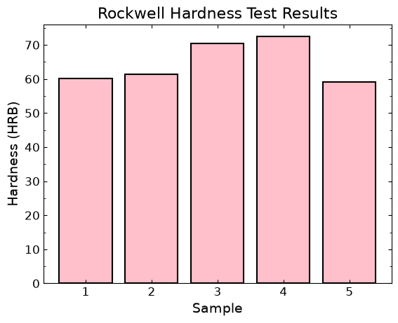
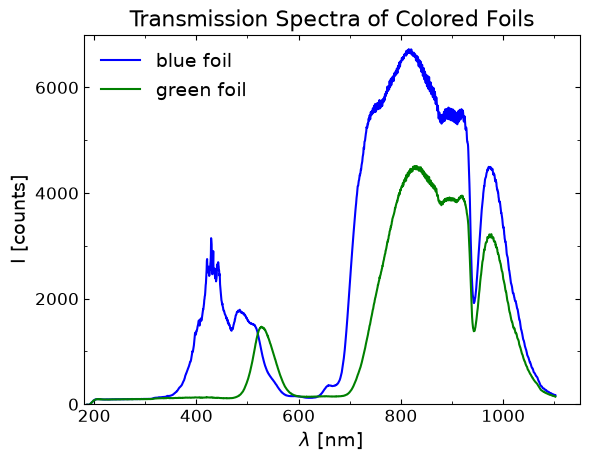
While we still need to go into each figure and tweak settings here and there, these rcParams overrides are a good starting point to make figures that are pleasing to look at.
16.9Final thoughts
Making impactful and pleasing figures is a desirable skill for a scientist and engineer. These past lessons on using the Matplotlib library have shown you ways to make scatter plot, bar graphs, and histograms. There are many other types of plots that this library can handle, so we recommend looking at Matplotlib’s extensive tutorials section on their website for help and inspiration. Have fun making great looking plots!