14 Matplotlib: Basic Plotting
14.1Lesson goals
Use Matplotlib’s function-based, implicit command style to quickly make simple plots.
Discover ways to improve figure aesthetics.
Import data and plot using NumPy and Matplotlib.
Create multiple dataset plots.
Create multiple panel plots.
14.2Overview
The ability to visualize data graphically is an important skill for an engineer. These graphical representations are often referred to as “figures” or “plots”, and they are vital when analyzing data or communicating information to an audience. Even though the Python shell is a text-based interface, there are numerous graphing libraries available. One of the most popular graphing libraries is Matplotlib. This lesson will cover the basics of creating scatter plots using Matplotlib. We will first show how to plot a single dataset, then create single plots with multiple datasets, and finally create a multiple panel plots. This lesson also lays the groundwork for us to learn Matplotlib’s more powerful object-oriented approach to plotting.
14.3Installing the Matplotlib library
Matplotlib is not part of the standard Python library. However many library repositories have it. The steps below go over how to install Matplotlib to your Python virtual environment using Miniforge:
Open up Miniforge.
Activate your Python environment.
Type
conda install -c conda-forge matplotlibin the command line interface.Follow the onscreen commands to install the library.
Restart VSCode or JupyterLab if they are currently opened once the library is installed.
14.4Importing Matplotlib
The Matplotlib library is large and can seem overwhelming at first. Fortunately, most basic plotting functionality can
be found in the matplotlib.pyplot module. A common route to
import Matplotlib into Python is shown below:
import numpy as np
from matplotlib import pyplot as plt
The first command is to import NumPy. As discussed in a previous lesson, NumPy is a powerful
scientific computing library for Python. In addition to providing additional features such as mathematical
operations and array structures, Matplotlib natively reads NumPy datasets. While technically not needed for plotting
purposes, using NumPy library is highly encouraged when plotting with Matplotlib. Next, the second command imports the
pyplot module from Matplotlib. An alias name plt is used
for ease of typing.
When looking for a certain aspect or feature, it is highly recommended to search the
Matplotlib reference guide, run the help() function on a particular
feature, and perform internet searches. There is a lot of options and functionality to this useful library.
14.5Command styles to create plots
Matplotlib offers two command styles to create plots. The first style is an object-oriented programming focused,
“explicit command” style that uses Matplotlib’s
Figure and
Axes
classes to create highly customizable figures. The other command style is a fuction-based, “implicit command” style
that uses the pyplot module to
create figures quickly at the expense of customization. The implicit command style looks very similar to plotting in
MATLAB.
Both styles are commonly used, so it is important to learn both! The implicit command style mimics the explicit command style in many cases and is a little easier to use, so let’s first learn Matplotlib with the implicit command style first before using the OOP approach.
14.6Plotting using the implicit command style
The implicit interface is great for situations where you need to make simple plots quickly. A plot can be made very quickly using this route. Let’s first create a blank figure:
plt.plot()
plt.show()
Congrats on making your first plot! While it doesn’t contain data yet, we can see that creating a figure is done with
two commands. The first command,
pyplot.plot() (going forward we
will just call it plt.plot()), is
the main function used to create a plot. No arguments create a blank figure. We will add arguments very soon to create
informative figures. After that command is
plt.show(), which tells the shell to display
the figure.
Let’s now plot the list object [1, 3, 8, 10, 5] by adding it as an argument to plt.plot():
plt.plot([1, 3, 8, 10, 5])
plt.show()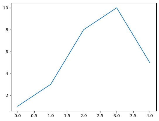
Notice that plt.plot() assumes the argument is the y-values and creates x-values based on the index number of the
list. We can add x-values by including another list to plt.plot():
plt.plot([0, 2, 6, 10, 12], [1, 3, 8, 10, 5])
plt.show()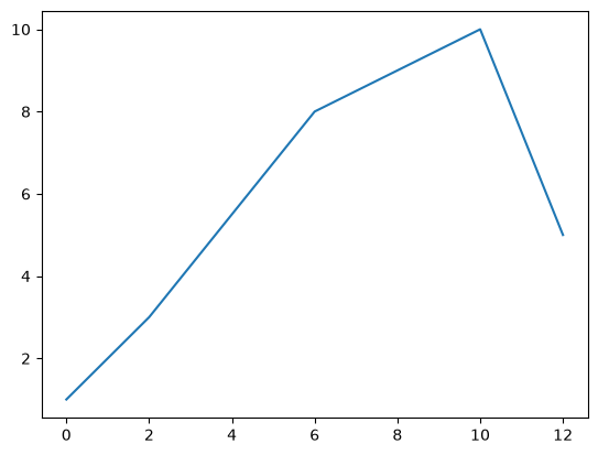
Congrats on your next milestone, you created an “informative” figure that includes data. Even though this is a simplistic first step, we can see that Matplotlib allows us to create figures quickly. The rest of this lesson focuses on how to make our plots more informative and aesthetically pleasing.
14.7Plotting with variables
We can also use variables as our x- and y-values in plt.plot() instead of manually adding list objects. This
probably the route you will commonly use when plotting. For this example, let’s plot the cosine function:
The code block below demonstrates how to do this:
# Create the data
x1 = np.arange(1, 11, 0.05)
y1 = 10 * np.cos(2*x1)

# Make the plot
plt.plot(x1, y1)
plt.show()
As you can see, replacing simple lists with variables is straightforward. This simple change in how load data in
plt.plot() allows us to easily plot more interesting data.
14.8Prettying things up
While the figure above is serviceable, it is lacking many important aspects like axes labels, well formatted tick marks, and a title (since we do not have a figure caption). Let’s make the figure look pretty by adding a title and axes labels:
plt.plot(x1, y1)
plt.title("Single plot of y1 vs. x1")   # Set figure title
plt.xlabel("x1")                        # Set x-axis label
plt.ylabel("y1")                        # Set y-axis label
plt.show()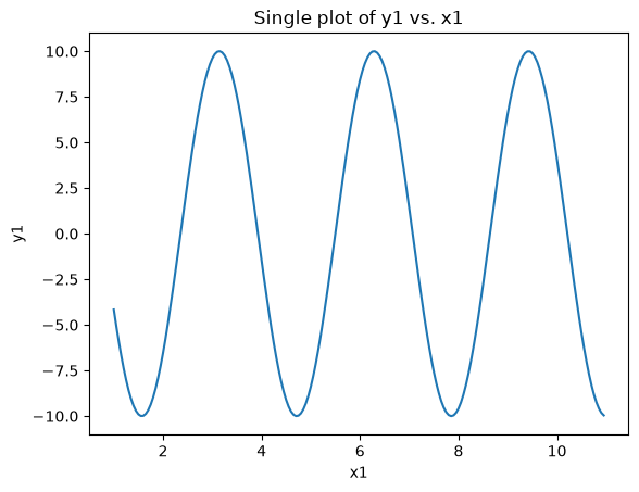
The code block above uses three functions to make the plot more informative. The
plt.title() function adds a figure title
via a str object. The next two functions,
plt.xlabel() and
plt.ylabel(), work in similar way by
adding x- and y-axes labels, respectively. Let’s now modify the tick marks:
plt.plot(x1, y1)
plt.title("Single plot of y1 vs. x1")
plt.xlabel("x1")
plt.ylabel("y1")
plt.tick_params(axis="both",       # Adjust both x- & y-axis ticks
                direction="in",    # Set inside tick marks
                top="on",          # Display tick marks for top axis / spine
                right="on")        # Display tick marks for right axis / spine
plt.show()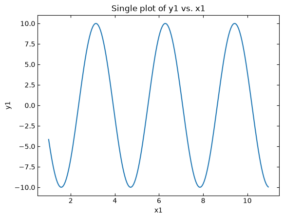
The plt.tick_params() function shown
above gives us the ability to adjust the tick marks on all four sides of the figure (also known as “spines”). The
arguments used in the code block above adjusts both x- and y-axes tick marks, sets the tick marks to be on the
inside of the axes, and ensures all four spines get tick marks.
The range of each axis can also be set using the
plt.axis() function. The function plt.axis()
requires a list or tuple in the form of [xmin, xmax, ymin, ymax] or (xmin, xmax, ymin, ymax) in order to set
the axis range. The code block below demonstrates how to use this function:
plt.plot(x1, y1)
plt.axis([0, 12, -12, 12])             # [xmin, xmax, ymin, ymax]
plt.title("Single plot of y1 vs. x1")
plt.xlabel("x1")
plt.ylabel("y1")
plt.tick_params(axis="both",
                direction="in",
                top="on",
                right="on")
plt.show()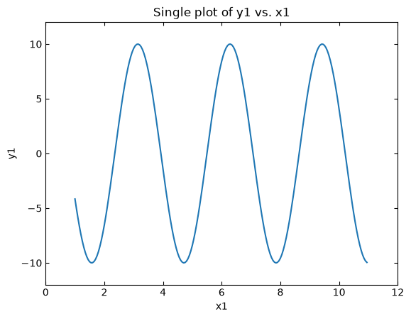
We can also change the style and color of the line plot. There are a few ways of doing
this with plt.plot(). The simplest way is to add a third position argument after the y-data in plt.plot() that
represents the display style. Matplotlib has both short form and long form ways of doing this. For example, we can
change the data to be blue dots by adding the command bo where b represents the blue color and o represents a
filled circle marker. The code block below demonstrates how to add this as an additional positional argument to
plt.plot():
plt.plot(x1, y1, "bo")              # Circle dots and blue color
plt.axis([0, 12, -12, 12])
plt.title("Single plot of y1 vs. x1")
plt.xlabel("x1")
plt.ylabel("y1")
plt.tick_params(axis="both",
                direction="in",
                top="on",
                right="on")
plt.show()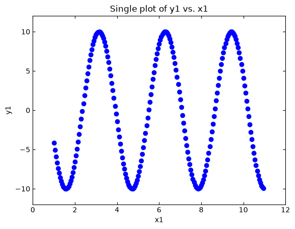
The short hand notation is good in pinch but can be hard to read. Fortunately, plt.plot() has numerous keyword
arguments you can use:
marker: Type of marker to be used (e.g., circle, square, triangle) when displaying a data point. Matplotlib’s Marker reference page has a list of commonly used markers. Entered value is astrthat represents a marker type (e.g.,orepresents a filled circle). Default value isNone, meaning no data point will be shown.fillstyle: The interior fill color of the marker. Entered value is astr. Matplotlib’s Marker reference page has a list of fill styles.markersize: The size of the marker. Entered value is anintorfloat.linestyle: Style of the connecting line between data points. Entered value is astr, and the default value is a solid line (i.e.,solid). Matplotlib’s Linestyles page has different linestyles.color: The color state for both the marker and connecting line. More details below:There are a few different ways to designate color (e.g., RGB value, shorthand single character notation, color name) → all are entered as a
str.Matplotlib’s Specifying Colors page has various ways to declare color. Matplotlib’s List of named colors page has commonly used color names.
Let’s try this out with our current code block:
plt.plot(x1, y1,
        linestyle="none",       # No connecting line
        marker="o",             # Circle marker points
        fillstyle="none",       # Markers are not filled
        markersize=12,          # Marker size of 12
        color="blue")           # Marker color is blue
plt.axis([0, 12, -12, 12])
plt.title("Single plot of y1 vs. x1")
plt.xlabel("x1")
plt.ylabel("y1")
plt.tick_params(axis="both",
                direction="in",
                top="on",
                right="on")
plt.show()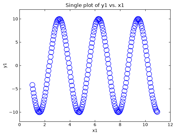
The keyword argument approach significantly increases the readability of the code so it is easier to go back later and make changes.
14.9Image and masking demo
Now that we have some basic skills in plotting, let’s demonstrate how we can combine NumPy and
Matplotlib to adjust an image. NumPy is often used with storing and manipulating images because they ultimately are
arrays of data. Often images are represented as NumPy arrays whose shape values matches the pixel height and
width of the images. Each array entry then stores a color value of an individual pixel value as a three element list in the format
[red, green, blue] (i.e., the RGB color format). Depending on the color scale of choice, each color value
(i.e., a “channel”) is assigned an integer value bounded between 0 and a maximum value. One very popular color value
scale is to assign each channel as an 8-bit integer (i.e., bounded between 0 and 255). Since there are three color
channels that are each represented as an 8-bit integer, this is called a 24-bit (8 x 3) or RGB24 color scale.
The code block below creates an 8 x 8 pixel image of a smiley face using a 24-bit color scale. Since this example plots
an image instead of scatter plot, we will use the
plt.imshow() instead of plt.plot().
Using plot.imshow() for an image is very similar to using plt.plot() for a scatter plot.
smiley = np.array([[[0,0,0],[0,0,0],[241,222,0],[255,235,0],[255,235,0],[241,222,0],[0,0,0],[0,0,0]],
          [[0,0,0],[225,207,0],[255,232,50],[255,232,50],[255,232,50],[255,232,50],[225,207,0],[0,0,0]],
          [[241,222,0],[255,232,50],[34,31,0],[255,232,50],[255,232,50],[34,31,0],[255,232,50],[241,222,0]],
          [[255,235,0],[255,232,50],[255,232,50],[255,232,50],[255,232,50],[255,232,50],[255,232,50],[255,235,0]],
          [[255,235,0],[255,232,50],[255,232,50],[255,232,50],[255,232,50],[255,232,50],[255,232,50],[255,235,0]],
          [[241,222,0],[255,232,50],[34,31,0],[255,232,50],[255,232,50],[34,31,0],[255,232,50],[241,222,0]],
          [[0,0,0],[226,207,0],[255,232,50],[34,31,0],[34,31,0],[255,232,50],[253,232,0],[0,0,0]],
          [[0,0,0],[0,0,0],[239,219,0],[240,221,0],[240,221,0],[239,219,0],[0,0,0],[0,0,0]]], dtype=np.uint8)

plt.imshow(smiley)
plt.show()
print("Smiley shape:", smiley.shape)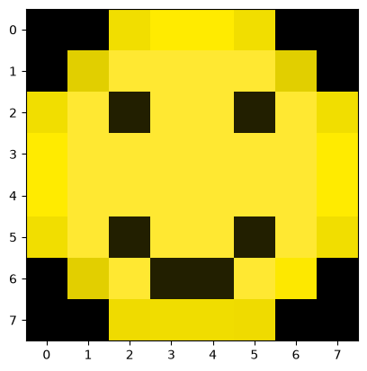
Smiley shape: (8, 8, 3)
While the array creation is a bit long and cumbersome, you should be able to see that each element gets assigned a
three element list with the datatype numpy.uint8, which is an “unsigned 8-bit integer” (i.e., integer value bounded
between 0 and 255). In NumPy speak, this means we have created a NumPy array of shape (8,8,3), which can be thought
of as a three-dimensional array that has a height of 8, a width of 8, and a depth of 3. We use the depth dimension
to store the 24-bit color value [red, green, blue].
We can manipulate our image using the numpy.tranpose() function from earlier but using additional
arguments. For example, let’s transpose just the first and second dimensions (“axes”), leaving the third alone
(the color values) alone:
plt.imshow(np.transpose(smiley, axes=[1,0,2]))      # Transpose the 0 and 1 axes of the array
plt.show()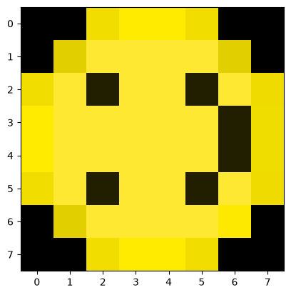
We can rotate the array by 90 degrees as well using the
numpy.rot90() function:
plt.imshow(np.rot90(smiley, 2))                     # Rotate the array 90 degrees two times
plt.show()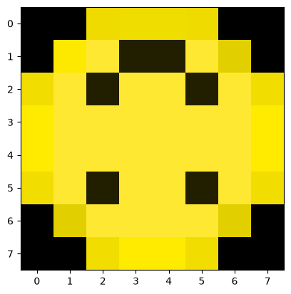
In the example above, we rotate our image by 90 degrees two times with the 2 positional argument.
Another common pattern when working with image data in NumPy is to create a True/False “mask” of an image
that corresponds to some color threshold:
# Create a boolean array the same shape as smiley
mask = np.zeros(smiley.shape, dtype=bool)

# Where values in smiley are greater than 50, set mask to True
mask[smiley > 50] = True

# Create an empty array the same size as smiley
smiley_copy = np.empty(mask.shape, dtype = np.uint8)

# Where the mask is True, set the value to 255
smiley_copy[mask] = 255
# Where the mask is False, set the value to 0
smiley_copy[~mask] = 0

plt.imshow(smiley_copy)
plt.show()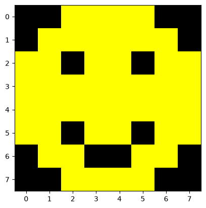
Here, we create a boolean mask of same size as our original image using numpy.zeros(), which
defaults to False. Darker pixels, like the shades of black, will all have very low values around 0. We then use the
statement mask[smiley>50] = True to set any element in mask to true if the original image’s color value is greater
than 50.
After this is done, we create the smiley_copy array that is empty but matches the size of mask. In the assignment
smiley_copy[mask] = 255, we set all elements in smiley_copy to 255 if mask has a corresponding value of True.
At first glance, the next commands, smiley_copy[mask] = 255 and smiley_copy[~mask] = 0, look odd as they use the
~ operator. The ~ tilde operator is a shorthand for
numpy.invert(),
which inverts our mask so False and True values switch. With that, we have created a mask of an image by
thresholding it against some color value, and then generate a new image based on that mask.
14.10Importing data into a plot
Importing data to plot is very common task. Let’s show you how to do this with a UV-Vis transmission spectrum dataset. Let’s first load the file following data file into Python. It is a two column data file that contains the following:
First column: Light wavelength (unit: nm).
Second column: Transmission intensity (unit: counts).
Data points separated (i.e., delimited) with a “tab” character (
\t).First row contains header information.
The code block below uses numpy.loadtxt() to load the data into our Python shell:
# Load data
spectrum_data = np.loadtxt("./static/example-data/blue_foil_transmission_spectrum.txt",
                           delimiter="\t",
                           skiprows=1)

print(spectrum_data)
[[ 186.716 -8.9 ]
[ 187.188 -8.9 ]
[ 187.66 -8.9 ]
...
[1101.369 172.68 ]
[1101.788 169.58 ]
[1102.206 170.99 ]]
We included a print() call just to demonstrate that the data has been loaded into the shell. The output only shows
the first few and final rows. Our next step will be to separate the columns out as individual objects:
# x and y data points
wavelength = spectrum_data[:, 0]
intensity = spectrum_data[:, 1]
Now we can plot using plt.plot():
plt.plot(wavelength, intensity,
         linestyle="solid",
         color="blue")
plt.axis([200, 1150, 0, 10000])
plt.title("Blue Foil Transmission Spectrum")
plt.xlabel("wavelength [nm]")
plt.ylabel("intensity [counts]")
plt.tick_params(axis="both",
                direction="in",
                top="on",
                right="on")
plt.show()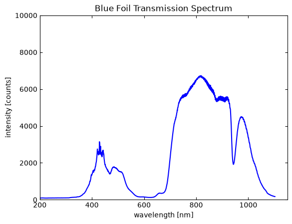
Overall, importing data and plotting a commonly performed process that uses both the Matplotlib and NumPy libraries. We highly recommend referring back to this section in the future as the overall programming structure can be resused when you need to load and quickly plot data.
14.11Multiple datasets in one figure
Matplotlib allows for plotting multiple datasets to a single figure panel. To demonstrate this, let’s plot the following equations in a single panel figure:
The setup is straightforward as we simply use sequential plt.plot() calls for each dataset. The code block below
shows how to do this:
x = np.arange(1, 11, 0.05)

y1 = 10 * np.cos(2*x)
y2 = 0.001 *np.exp(x) - 2.1
y3 = 2 * np.power(x,2) - (10 * x) - 3

# y1 -> solid blue line
plt.plot(x, y1,
         linestyle="solid",
         color="blue")

# y2 -> open red circles
plt.plot(x, y2,
         marker="o",
         linestyle="none",
         color="red")

# y3 -> forest green open stars with dashed connecting line
plt.plot(x, y3,
         marker="*",
         fillstyle="none",
         markersize=12,
         linestyle="dashed",
         color="forestgreen")

plt.axis([0, 12, -20, 20])
plt.xlabel("x1")
plt.ylabel("y")
plt.show()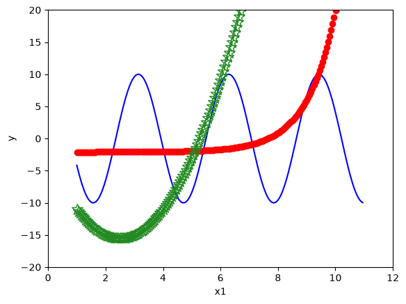
To add a legend we need to include two additional features to our code block:
x = np.arange(1, 11, 0.05)

y1 = 10 * np.cos(2*x)
y2 = 0.001 *np.exp(x) - 2.1
y3 = 2 * np.power(x,2) - (10 * x) - 3

# y1 -> solid blue line
plt.plot(x, y1,
         label="cosine",
         linestyle="solid",
         color="blue")
# y2 -> open red circles
plt.plot(x, y2,
         label="exponential",
         marker="o",
         linestyle="none",
         color="red")
# y3 -> forest green open stars with dashed connecting line
plt.plot(x, y3,
         label="power",
         marker="*",
         fillstyle="none",
         markersize=12,
         linestyle="dashed",
         color="forestgreen")

plt.axis([0, 12, -20, 20])
plt.xlabel("x1")
plt.ylabel("y")
plt.legend(frameon=False)
plt.show()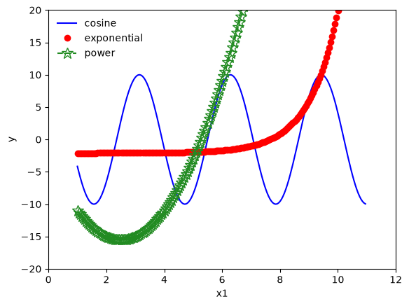
As shown above, we include
label
arguments to each plt.plot() call, which are str-based label for each dataset. We also issue the
plt.legend() function which inserts a
legend to the figure. The label arguments populate the legend. The optional frameon=False argument
removes the border around the legend. Always remember to include a legend when making multiple dataset figures.
14.11.1Example: Even more spectra
Replot the blue foil optical transmission spectrum from the previous example but also include the transmission spectrum for a green foil in the figure. Rename the figure title to be “Transmission Spectra of Colored Foils” and add a legend. Color code the datasets so that the blue foil data is blue and the green foil data is green.
Solution:
As the lesson above discusses, plotting multiple datasets in a single figure is straightforward with Matplotlib. We
just need to issue each plt.plot() call one at a time. The code below demonstrates this:
# Libraries
import numpy as np
from matplotlib import pyplot as plt

# Load blue foil
blue_foil = np.loadtxt("./static/example-data/blue_foil_transmission_spectrum.txt",
                           delimiter="\t",
                           skiprows=1)

blue_wavelength = blue_foil[:, 0]
blue_intensity = blue_foil[:, 1]

# Load green foil
green_foil = np.loadtxt("./static/example-data/green_foil_transmission_spectrum.txt",
                           delimiter="\t",
                           skiprows=1)

green_wavelength = green_foil[:, 0]
green_intensity = green_foil[:, 1]

# Plot blue foil
plt.plot(blue_wavelength, blue_intensity,
         label="blue foil",
         linestyle="solid",
         color="blue")

# Plot green foil
plt.plot(green_wavelength, green_intensity,
         label="green foil",
         linestyle="solid",
         color="green")

plt.axis([200, 1150, 0, 10000])
plt.title("Colored Foils Transmission Spectra")
plt.xlabel("wavelength [nm]")
plt.ylabel("intensity [counts]")
plt.tick_params(axis="both",
                direction="in",
                top="on",
                right="on")
plt.legend(frameon=False)
plt.show()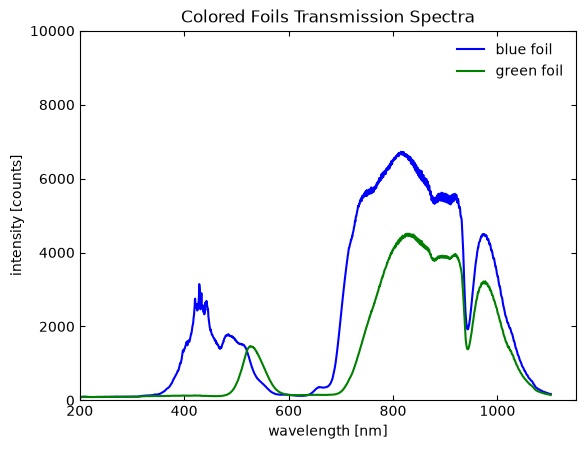
14.12Multiple panel plotting
Multiple panel plots (i.e., plots with subpanels) are organized in Matplotlib using an grid-like structure. Creating
this grid structure is handled using
plt.subplot() and requires three
arguments in the form of (row, col, idx). The subpanel grid is set to be row col large and the idx
value defines which subpanel position that will be worked on. The idx value starts at 1 in the top left location and
increases right and then down. It’s a bit confusing to explain, but it makes more sense when you use it. The code block
below plots our three mathematical functions from ealier in separate subpanels:
# 2 x 2 grid of sub-panels. Label numbers:
# |-----|-----|
# |  1  |  2  |
# |-----|-----|
# |  3  |  4  |
# |-----|-----|

# Top left sub-panel
plt.subplot(2, 2, 1)
plt.plot(x, y1, "b-")
plt.xlabel("x1")
plt.ylabel("y1")

# Top right sub-panel
plt.subplot(2, 2, 2)
plt.plot(x, y2, "ro")
plt.xlabel("x1")
plt.ylabel("y2")

# Bottom right sub-panel
plt.subplot(2, 2, 3)
plt.plot(x, y3, "g--")
plt.xlabel("x1")
plt.ylabel("y3")

plt.show()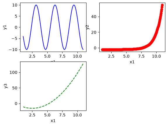
Notice that the x-axis label in the top left subpanel overlaps with the bottom left subpanel. We can increase the
figure size using plt.figure(). The
default figure size is 6.4 in x 4.8 in (height, width). Let’s increase the overall figure size by 40 %:
# 2 x 2 grid of sub-panels. Label numbers:
# |-----|-----|
# |  1  |  2  |
# |-----|-----|
# |  3  |  4  |
# |-----|-----|

plt.figure(figsize=[9, 6.75])

# Top left sub-panel
plt.subplot(2, 2, 1)
plt.plot(x, y1, "b-")
plt.xlabel("x1")
plt.ylabel("y1")

# Top right sub-panel
plt.subplot(2, 2, 2)
plt.plot(x, y2, "ro")
plt.xlabel("x1")
plt.ylabel("y2")

# Bottom right sub-panel
plt.subplot(2, 2, 3)
plt.plot(x, y3, "g--")
plt.xlabel("x1")
plt.ylabel("y3")

plt.show()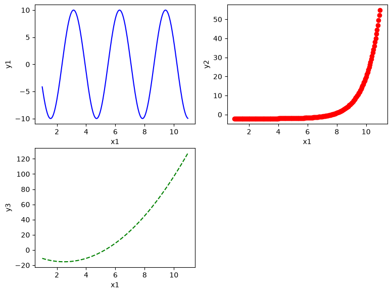
Much better! We can now see everything!
14.13Final thoughts
The implicit interface is great for simple plotting and helps us understand some of the many plotting options in Matplotlib. However, many aspects of our plots are implied by the interpreter. For example, notice that in the multiple panel plot example we had to work on one subpanel at a time before moving on to the next subpanel. In order to better work on multiple figures at once and to open a much larger set of plotting options, we need to use the more advanced explicit command style that utilizes object-oriented programming. Even with these limitations, the implict command style taught in this lesson provides us way to now visualize data in an impactful way.